
This is a sweeeet graphic showing all objects in our solar system that are bigger than 320km (200 miles) in diameter. It’s really fun to compare objects. (click the thumbnail above to expand the picture)
Examples:
Ganymede and Titan are bigger than Mercury!
The Moon is 71% the size of Mercury
Earth and Venus are virtually the same diameter
Pluto is smaller than the Moon!
Saturn’s moon Mimas (third smallest) looks alarming like the Death Star.
(it would appear I’m not the first to notice this – it’s even in the death star wikipedia article)
Which brings up the obvious question… Where does the Death Star fit on this chart? Well, I did some quick research and it seems like the standard accepted diameters for the Death Stars were 120km and 160km* – well below the sizes of any of the objects in the above linked graphic.
What about the borg cube? Wikipedia uses a Seven of Nine quote to size a borg cube at about 3km square. Pretty weak in comparison. Let’s look at a Mike D created graphic:
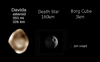
The borg cube is that single pixel off to the right. Whoa tiny!
Props to Alan Taylor, the creator of the astronomy size chart. If you’re interested you can purchase the full size poster here.
*or so claims this extremely technical analysis of the death star.
All this tells me is that the Borg Cube possesses way more awesomeness per square meter.
That’s no moon!
Also, the solar system does not obey Zipf”s law
HA!
nomination: best comment 2009
Oh man, if I had thought it was that good, I would have used proper capitalization and punctuation.