if DEAD people understand hexadecimal, how many people understand hexadecimal?
Category: Geekdom
The Challenger Deep!
Whoa!
My Friends:
Nereus, the underwater vehicle I have been working on since 2005,
touched down in the Challenger Deep, 10900 meters depth at around 10am
this morning and has been working all day collecting rock and core
samples. We have had plenty of problems with nearly all the vehicle
systems during a series of shallower dives over the last 2 weeks but
overall everything is working well and our scientists Tim Shank and
Patty Fryer are very happy with the pictures and samples. Nereus is
currently the only existing vehicle that operates below 7000 meters.-Daniel
AWESOME
Amazing job Daniel and co.

The Nereus before its dive to The Deep, The Challenger Deep
from the Schenk Tank.
Astronomical Size Chart.

This is a sweeeet graphic showing all objects in our solar system that are bigger than 320km (200 miles) in diameter. It’s really fun to compare objects. (click the thumbnail above to expand the picture)
Examples:
Ganymede and Titan are bigger than Mercury!
The Moon is 71% the size of Mercury
Earth and Venus are virtually the same diameter
Pluto is smaller than the Moon!
Saturn’s moon Mimas (third smallest) looks alarming like the Death Star.
(it would appear I’m not the first to notice this – it’s even in the death star wikipedia article)
Which brings up the obvious question… Where does the Death Star fit on this chart? Well, I did some quick research and it seems like the standard accepted diameters for the Death Stars were 120km and 160km* – well below the sizes of any of the objects in the above linked graphic.
What about the borg cube? Wikipedia uses a Seven of Nine quote to size a borg cube at about 3km square. Pretty weak in comparison. Let’s look at a Mike D created graphic:
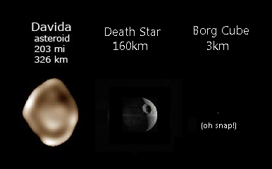
The borg cube is that single pixel off to the right. Whoa tiny!
Props to Alan Taylor, the creator of the astronomy size chart. If you’re interested you can purchase the full size poster here.
*or so claims this extremely technical analysis of the death star.
Zipf’s Law
Special thanks to Lauren and Professor Stodder for passing on this gem: Math and the City
The article points out a very strange correlation between a city’s population and the city’s size ranking.
“if you tabulate the biggest cities in a given country and rank them according to their populations, the largest city is always about twice as big as the second largest, and three times as big as the third largest, and so on”
Professor Stodder of RPI went one step further and actually checked the results using census data:
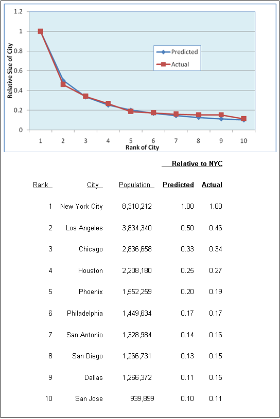
It’s known as Zipf’s law and it is eerie, spooky, and countless other words that mean creepy.
“Something is enforcing this invisible law, but we’re still in the dark about what that something might be. “
The article then digs deeper and talks about resources within the city. Gas stations (a decent indicator of energy consumption?) appear less frequently in bigger cities (per person), this is also true with roadways. So the bigger the city, the more efficient (this may be the wrong word choice) that city performs. THEN, we learn that the same is true for organisms. The article compares Mice to Elephants. Cells WITHIN those organisms have vastly different rates of energy consumption compared to their size (think economies of scale), but those same cells when removed from the animal show the same rates of metabolism. Weeeeeird? Yes.
“These numerical coincidences seem to be telling us something profound.”
Then we take a step from eerie coincidence to deeply philosophical as the researches realized that the metabolic needs of an animal increase in size at nearly the same percentage rate as a city’s needs for gas stations increase as they grow in size. All this without any real outside influence… it just happened naturally.
Math is freakin’ sweet.