At lunch this week Jocelyn and I were talking about text fonts and cities. The question is: If you had to choose a font to describe a city in its entirety, what font would you choose? Let’s take a look at Hartford, first we’ll start simply by describing the city, then we’ll try to find a font that screams ‘Hartford’
Hartford has a lot of insurance companies. Not many people live in the city and it’s about as far as you can get from ‘college town.’ It’s reasonably clean and seems to be a growing city. It has a good museum scene. It’s somewhat modern but it’s kind of tough to drive around. The public transportation is poor at best, but there’s a decent amount of parking.
Now for fonts… start by checking out this monster image of fonts:
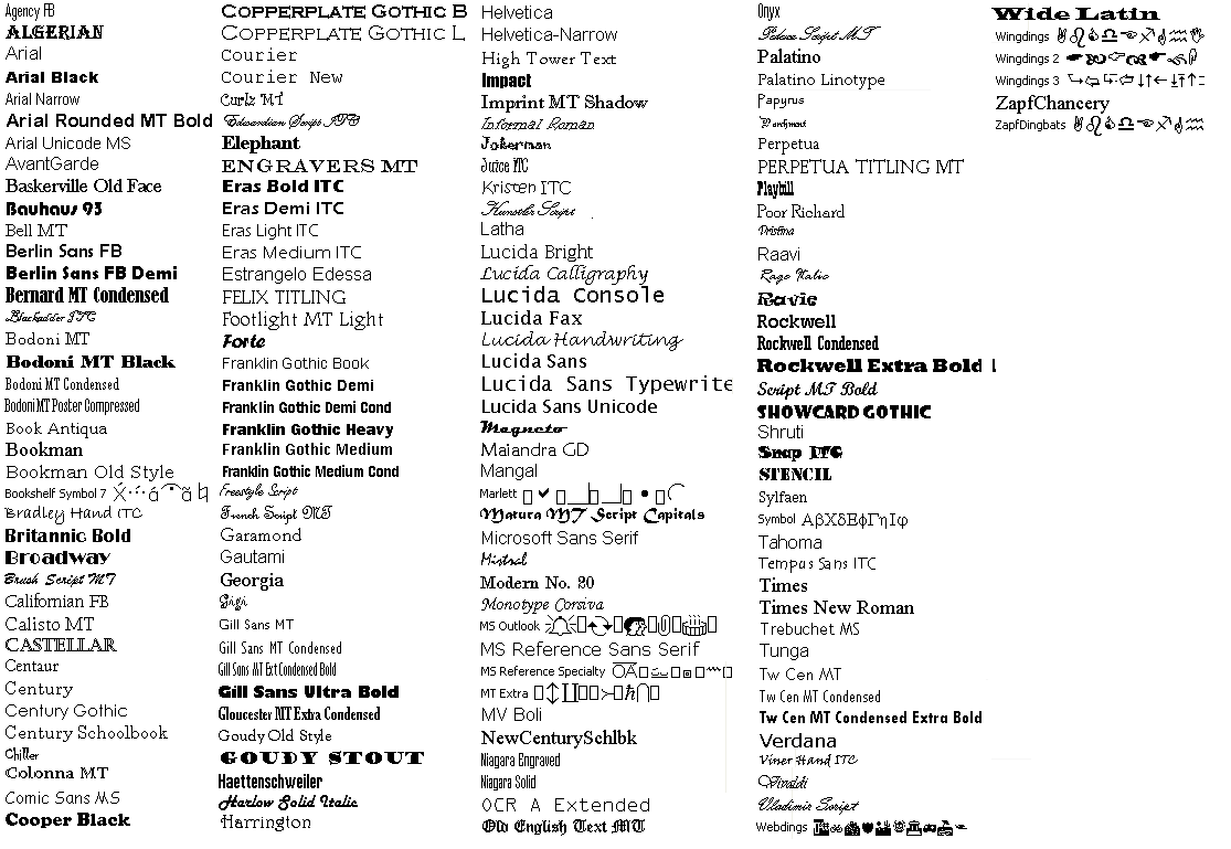
now… think Hartford.
Hartford is too modern for a Times New Roman and too formal to be anywhere near Wingdings. Courier New isn’t a bad choice, but I think Hartford has enough complexity to it to escape the burdensome scenario where each letter takes up the exact same number of longitudinal pixels.* And obviously, Hartford is not a script font.
Then there’s Ariel. Not a bad choice really, it doesn’t have any serifs (I don’t think Hartford is quite worthy of serifs). It might be just a tad bit too boring for Hartford. It shouldn’t be a bold or italicized font. Century is too classy. Helvetica… Helvetica could work. So could Raavi.
I think I prefer Raavi.
What font do you think best describes your city?
*there’s a word for this type of font. Anyone know it?
Worchester is so Wingdings 3
monospace
I’m gonna say Poor Richard. It’s traditional, understated, and fairly easy to overlook, but not completely boring.
I’ve always called them “fixed width” fonts, but yeah monospace is at least as good a word.
Boston is Garamond, I’d say. Classic, legible, stately. The high aspect ratio conveys the sophisticated tastes of the well-educated. I think the ascenders and descenders on the numerals add a little bit of class, like the brick sidewalks of the South End add to Boston. The tiny little eye on the ‘e’ is actually kind of odd-looking if you look really close — which you can say about pretty much any Bostonian you see on the street.
Arial is a cheapened derivative of Helvetica. Arial is not nearly as pretty, but the character widths and proportions are all the same as Helvetica.
Hartford isn’t Helvetica. Hartford is not in Switzerland.
I’d vote for Microsoft Sans Serif because that font fills me dread (like reading help files), just like driving through Hartford does.
Death to Arial, long live Helvetica.
Mike, Ariel is a small mutant fem-fish, not a font.
Ariel is a mermaid.
The appropriate font is “Black Arial”